statsandstuff a blog on statistics and machine learning
What makes a better score distribution?
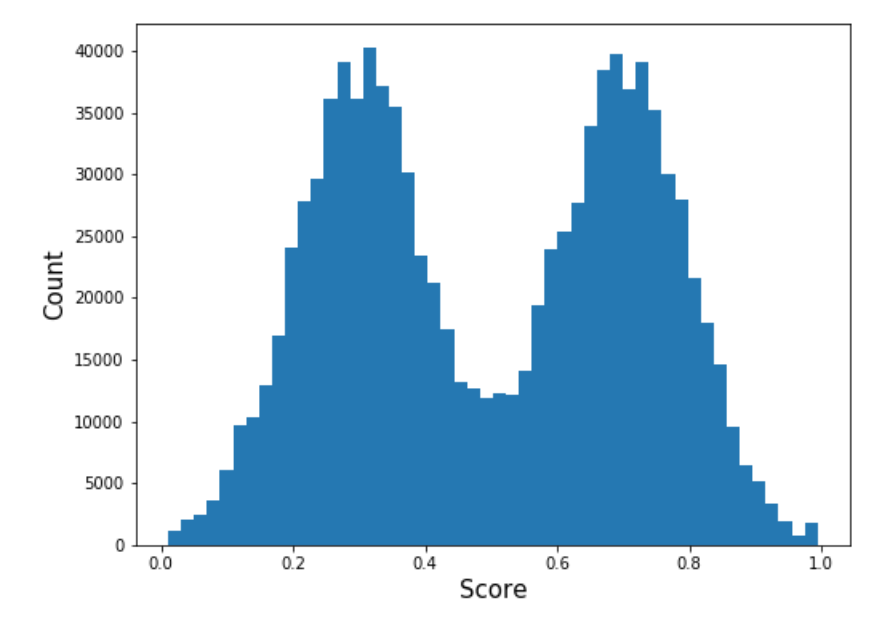
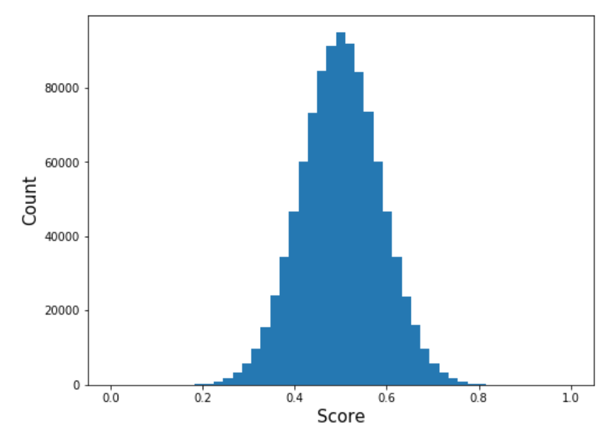
Suppose I train two binary classifiers on some data, and after examining the score distributions of each, I see the results below. Which score distribution is better? (And by extension, which classifier is better?)
 |
 |
A naive answer is that the bimodal distribution on the right is better because it “discriminates between the positive and negative classes.” But this is wrong. In fact, the above two score distributions are actually equivalent.
Introduction
We form a classifier from a score distribution by thresholding it at some value \(t\), and label an input as positive or negative depending on if its score is above or below \(t\). For a given classifer metric \(M\) (such as accuracy or a problem specific metric), let \(M_t\) denote the value of the metric when we threshold at \(t\). The best classifier obtainable from the score distribution (with respect to the metric \(M\)) has metric value \(M^* = \max_{t} M_t\). (Notice that precision isn’t a metric to optimize over a score distribution because the precision is 1 if the threshold is sufficiently high. Instead we optimize something like precision at a given recall in which \(M = \text{precision} \cdot 1_{\text{recall} \geq a}\) for some acceptable recall \(a\).)
Score distribution shape is very malleable, and we can artificially change the shape of a score distribution without altering key metrics. This is achieved by applying an increasing function to the scores that expands and contracts different parts of the distribution. The reparametrization preserves score order, and therefore does not alter the AUC or many \(M^*\) metrics (e.g., maximum accuracy or maximum recall at a given precision). It does, however, change how well the scores are calibrated.
Making scores look bimodal
We walk through an example to illustrate how flexible the shape of a score distribution is. In particular, we’ll make a Guassian score distribution look bimodal. The data is a set of observations, each with a model score, a true score, and a label. The true score is the actual probability that the label is positive and was used to simulate the labels. The model score is a random perturbation of the true score. (The code snippet below shows precisely how these three were defined.)
n = 1000000

truncate = lambda x : np.maximum(np.minimum(x, 1), 0)
true_scores = truncate(np.random.normal(size=n, loc=0.5, scale=0.14))
ys = np.random.binomial(n=1, p=true_probs)

e = np.random.normal(size=n, scale=0.1)
scores = truncate(0.5*(true_probs + e) + 0.25)
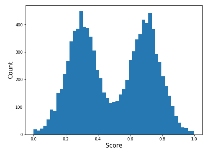
The distribution of model scores and true scores is plotted below. Both distributions are bell-shaped, but the model scores are narrower. If we calibrate the model scores, they will disperse to look more like the true scores.

Constructing a mapping
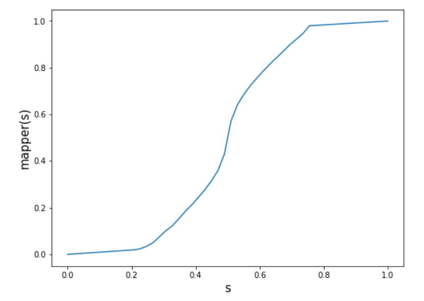
We want an increasing function that maps the original model score distribution onto a specified target distribution, e.g., the bimodal distribution below.
Constructing such a function is fairly straightforward. The basic procedure is outlined next.
-
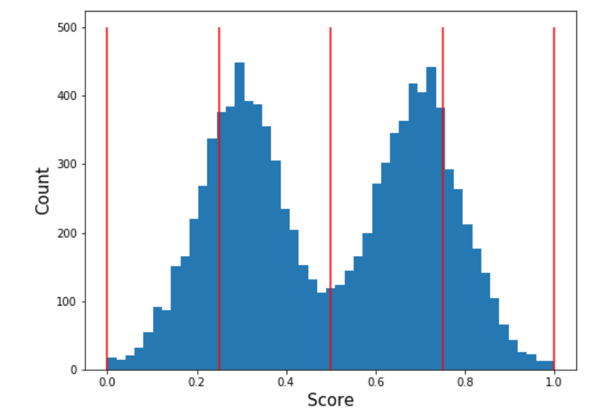
Divide the target distribution into \(n\) equally spaced buckets \([a_0, a_1], (a_1, a_2], \ldots, (a_{n-1}, a_n]\) and compute the probability mass of each. Let \(p_1, p_2, \ldots, p_n\) denote these masses. An illustration with \(n = 5\) is shown below.
- Divide the original distribution into \(n\) buckets \([b_0, b_1], (b_1, b_2], \ldots, (b_{n-1}, b_n]\) so that the probability mass of the \(j\)th bucket is \(p_j\). The buckets will not (necessarily) be equally spaced. This is depicted below.

- Define an increasing function \(f\) that scales and shifts the \(j\)th bucket of the original distribution onto the \(j\)th bucket of the target distribution (both of which have the same mass). This function maps the original distribution onto the target distribution. Explicitly the function is
The Python function below performs the above procedure. It takes a sample of original scores, a sample of target scores, and the number of buckets \(n\) as input and returns an increasing function that maps the original scores onto the target scores.
def get_mapping(scores_original, scores_target, n=50):

    # Group target scores into equally spaced bins
    # and compute the amount of data in each bin
    n_target = len(scores_target)
    a = np.linspace(0, 1, n)
    target = pd.DataFrame()
    target["Score"] = scores_target
    target["ScoreBinned"] = pd.cut(target["Score"], a)
    p = target.groupby("ScoreBinned").agg("count").values / n_target

    # Compute boundaries b for original scores that map onto target bins
    b = np.percentile(scores_original, q=100*np.cumsum(p))
    b = np.concatenate([np.array([0]), b])

    # In pratice the last element of b will be near 1
    # We ensure it is exactly 1 so that the mapping function is defined on [0, 1]
    b[-1] = 1.0

    # Define mapping function
    def mapping(x):
        for j in range(1, len(b)):
            if x <= b[j]:
                q1 = a[j] - a[j-1]
                q2 = np.maximum(b[j] - b[j-1], 0.001) # Prevent divide by 0

                return a[j-1] + q1 / q2 * (x - b[j])

        return 1.0

    return mapping
The mapping (with \(n = 50\)) that transforms the original Gaussian distribution into the bimodal target distribution is plotted below.
If we apply this mapping function to the original scores, we get the following distribution of mapped scores. (It looks like a replot of the target distribution, but there are slight differences between the two histograms in the valley between the peaks.)
The mapped bimodal distribution has the same AUC, precision at a given recall, and recall at a given precision as the original distribution. Even so, it would be very silly to prefer the bimodal distribution over the Gaussian one because we artificially created it.
What happened to the calibration?
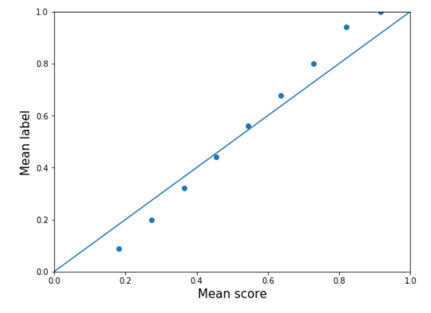
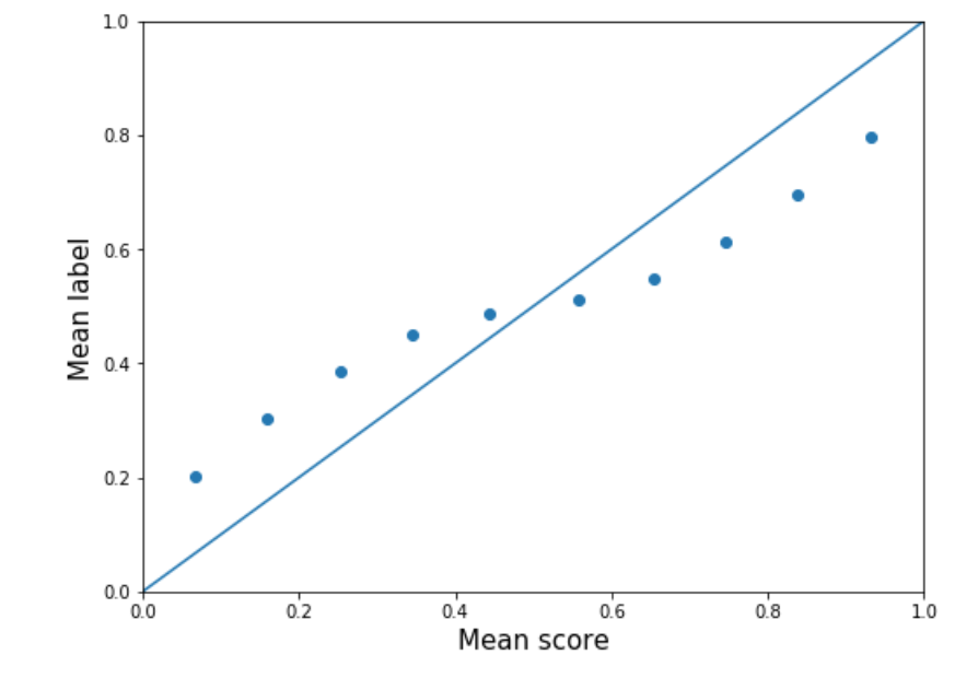
The better bimodal shape is the result of worse calibration. The calibration of the original scores is plotted on the left below, and the calibration of the mapped scores is plotted on the right. Although the mapped scores have OK calibration, the original scores have better calibration.
 |
 |
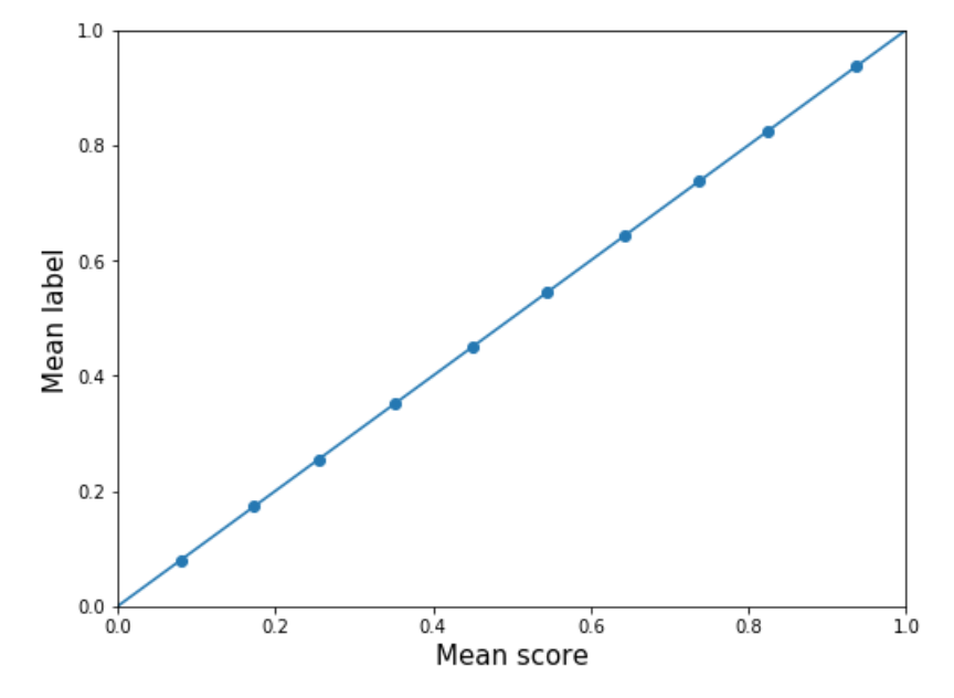
We can fix the calibration in both the original and mapped scores by applying an isotonic regression (which preserves ordering). Both distributions have the same shape after being calibrated (plotted below). The original scores become more spread out after calibration, and the bimodal shape of the mapped scores disappears.
 |
 |
Final thoughts
In the example in this post, we artificially created the “better” score distribution shape. But an ML algorithm can similarly create a better shape by not calibrating well, and this should be checked before claiming an algorithm gives a superior shape. Even then, it perhaps better to show that one algorithm is better than another with respect to important problem metrics rather than with respect to a subjective notion of good score distribution shape.
Written on September 29th, 2019 by Scott Roy